
Case studies / Group rebrand · Brand architecture · AI mobility
UVeye
A group rebrand for UVeye: an evolution of the original logo, a new parent brand, UVIQ, and one family of marks for UVEYE, UVMarket, VICO and UVRepair.
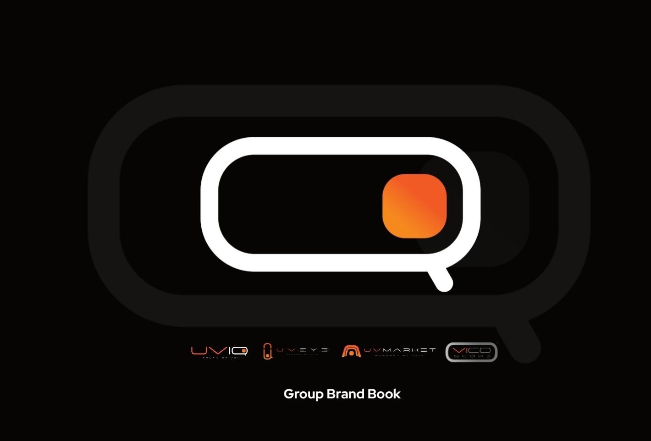
The business problem: an AI vehicle-inspection company had grown into a platform of products, but its brand still described a single scanner.
A product brand that had to become a group brand.
UVeye built its name on drive-through scanners that inspect a vehicle’s tires, underbody and exterior in seconds. The business had since grown into a marketplace, a vehicle condition score and repair services. Each new product risked looking like a separate company, and the brand no longer told buyers, partners or investors how big the platform had become.
An evolution, not a reinvention.
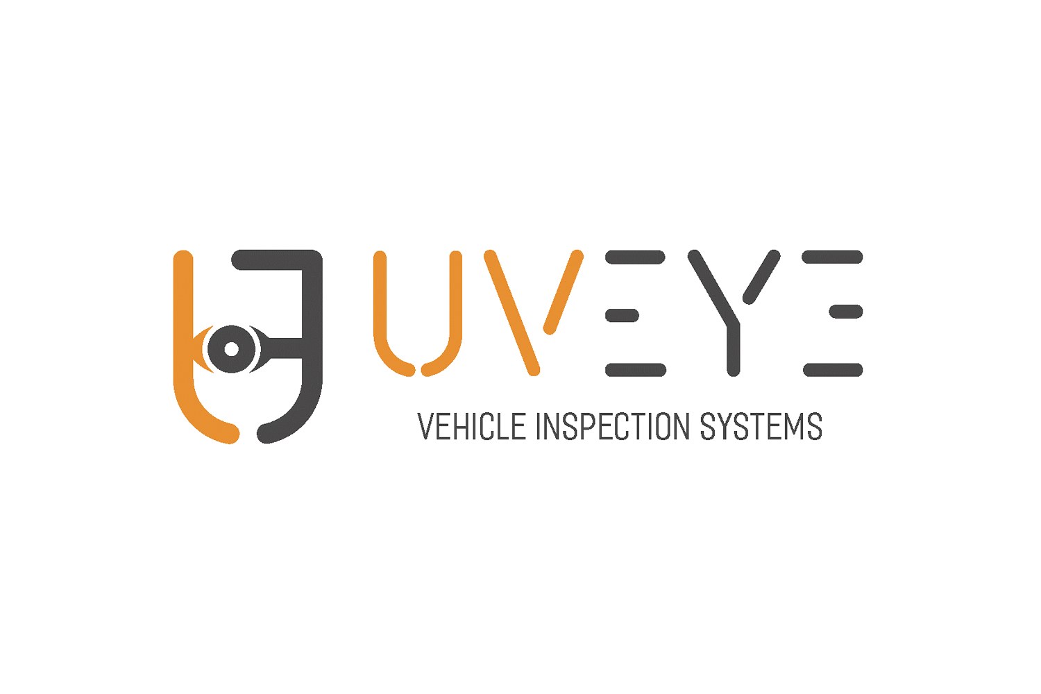
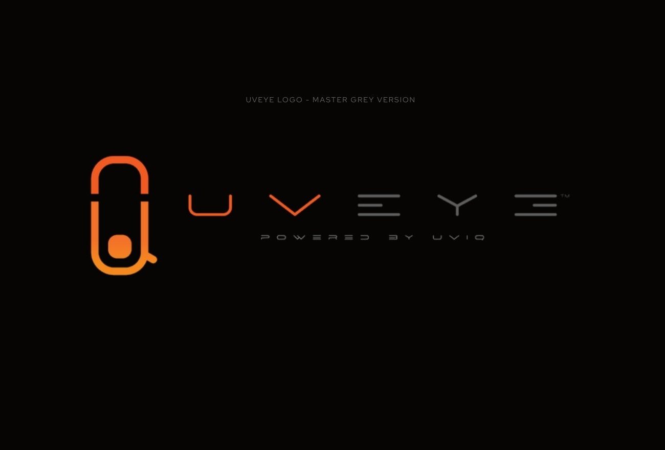
The original UVeye logo had real equity: orange and grey, rounded line-drawn letters and an eye set inside the U. The new UVEYE mark is historically inspired by it. It keeps the colours, the line language and the eye, and evolves them into a purer, more distinctive style: a single continuous form that reads as a U, an eye and a magnifying glass at once, and that can anchor a whole family of products. Customers who knew UVeye still recognise it, and the brand now looks like the category leader it has become.
From inspection. To intelligence. To infrastructure.
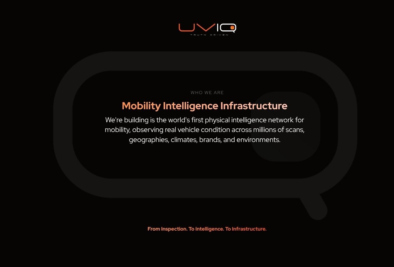
Every scan adds to something larger: a physical intelligence network that observes real vehicle condition across millions of scans, geographies, climates, brands and environments. The brand had to tell that story, positioning the group as mobility intelligence infrastructure rather than a piece of inspection hardware.
UVIQ. Truth Driven.
We created UVIQ as the parent brand and wrote its line, Truth Driven: the language of the automotive world and the discipline of a company moved by evidence rather than opinion. The UVIQ symbol, a rounded “Q” holding an illuminated cube, stands for vehicle, eye and active intelligence, and every product mark in the group descends from its geometry and gradient.
One family. Every product instantly recognisable.
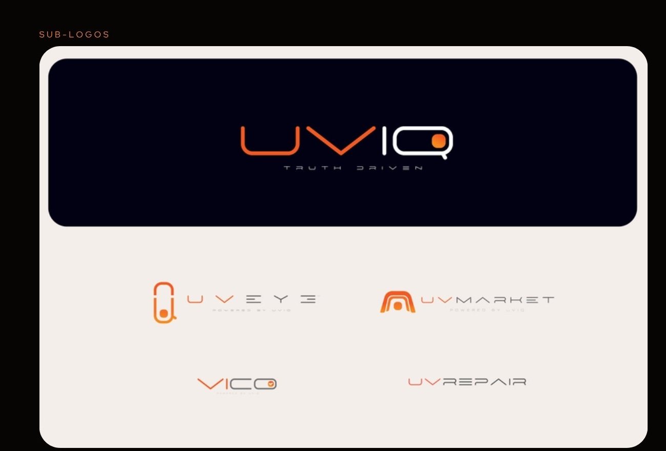
Each product got its own mark, all built from the same DNA and signed “Powered by UVIQ”: UVEYE for inspection intelligence, UVMarket for the marketplace, VICO for the verified vehicle condition score, and UVRepair. Together they turn a list of products into one platform story.
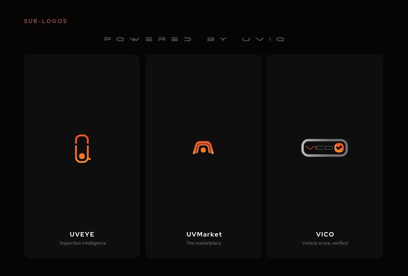
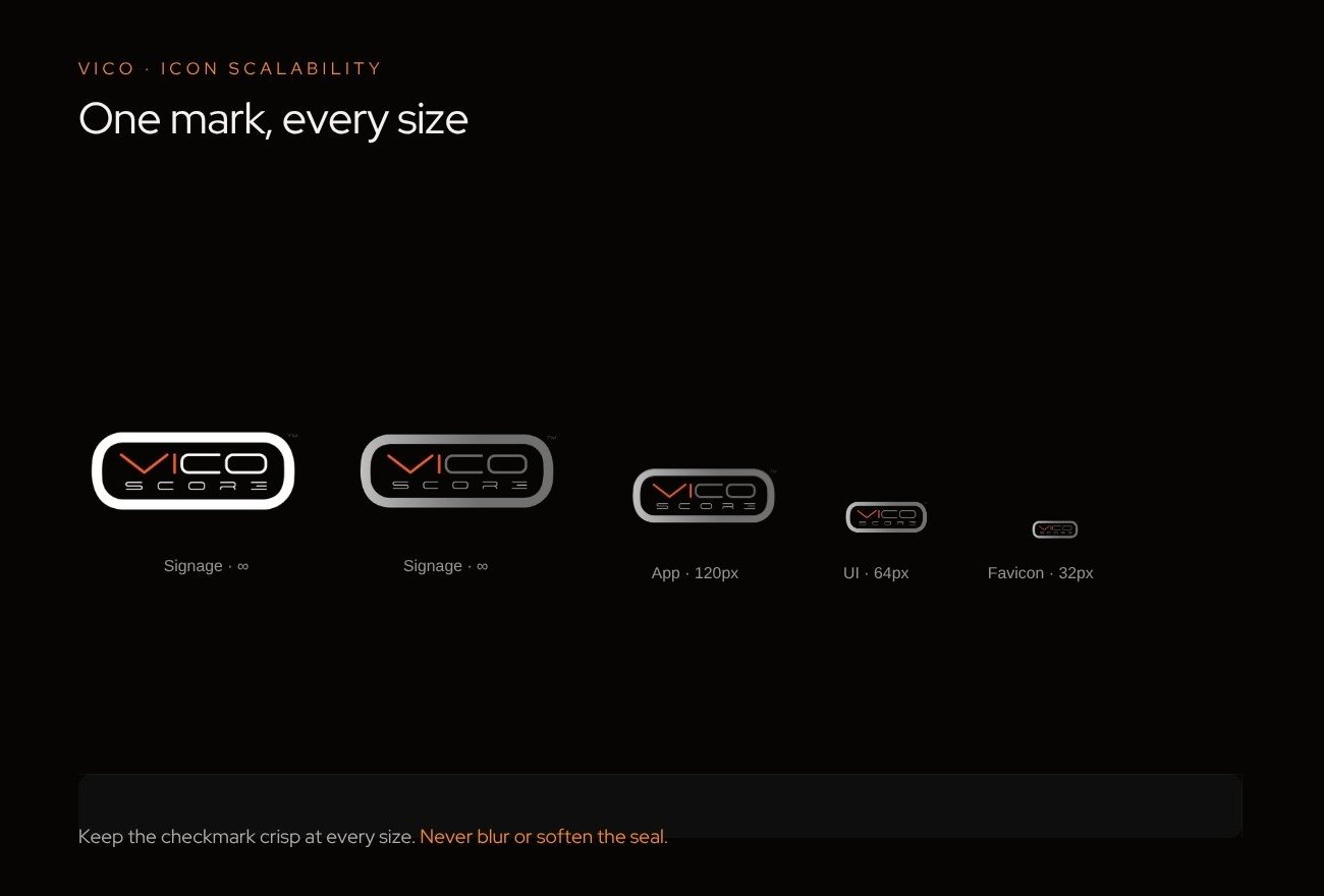
A brand system built to scale from a building to a 32px favicon.
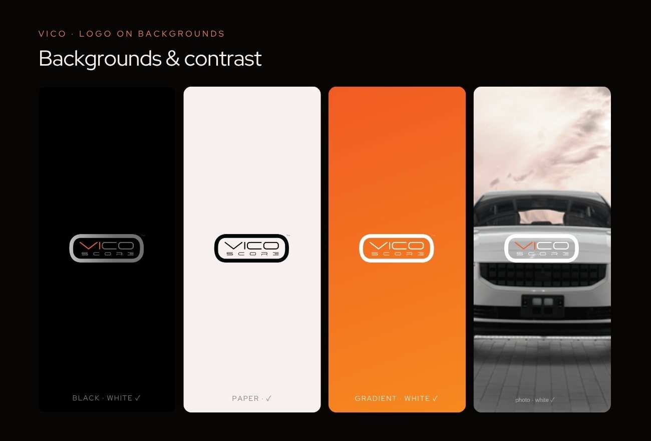
A full group brand book: the UVIQ master logo and symbol, all sub-brand logos and their meanings, one signature UV Orange to UV Amber gradient, Inter Tight as the single typeface, and rules for clear space, backgrounds and scaling, shown at work on signage, campaigns and stationery.
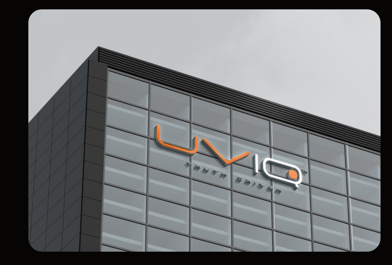
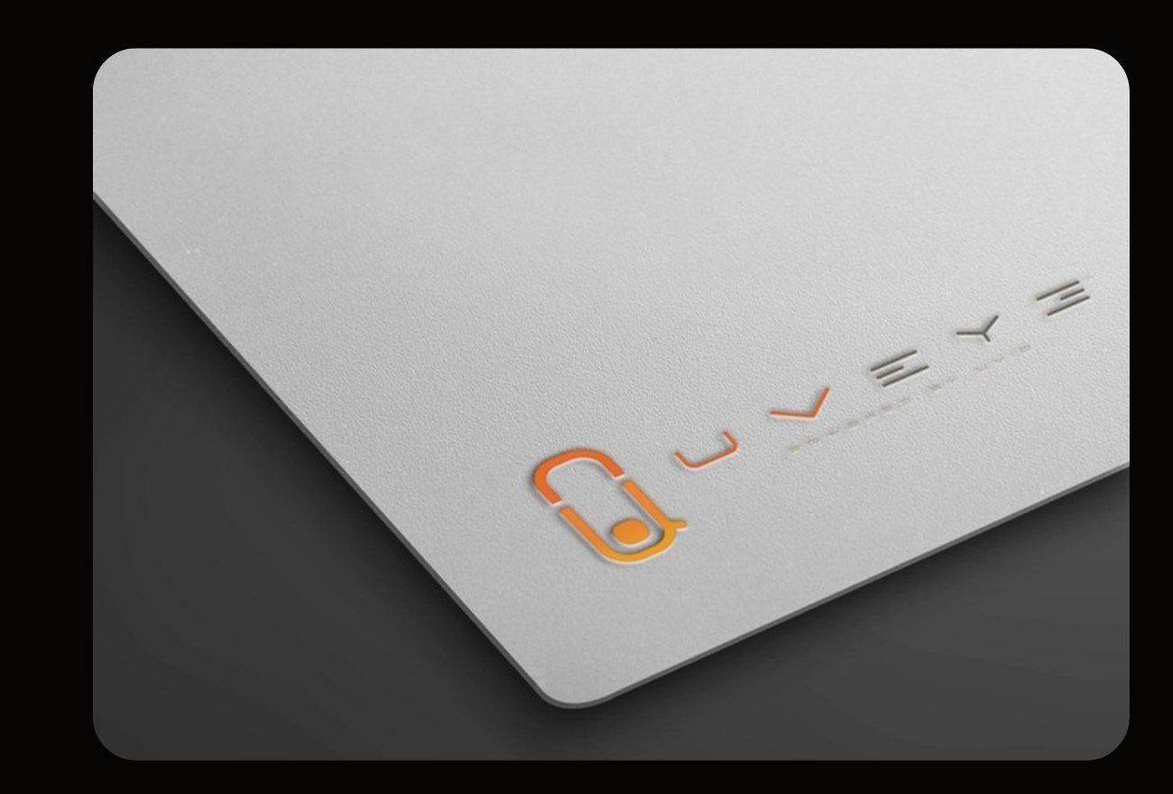
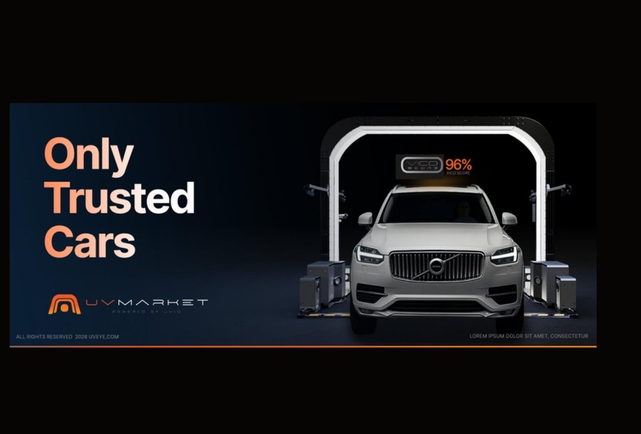
A platform that finally looks like one.
For a company selling AI to dealers, fleets and manufacturers, trust is the product. A single, coherent group brand makes every product easier to buy, because each one carries the credibility of the whole platform. It gives UVeye room to launch new products without diluting the core, and it lets every team, market and investor tell the same story: from inspection, to intelligence, to infrastructure.
Facing a similar challenge?
Book a 30-minute callNext case study: HOT: UX/UI · Digital experience · Brand video